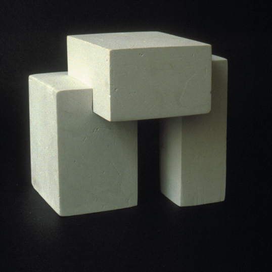
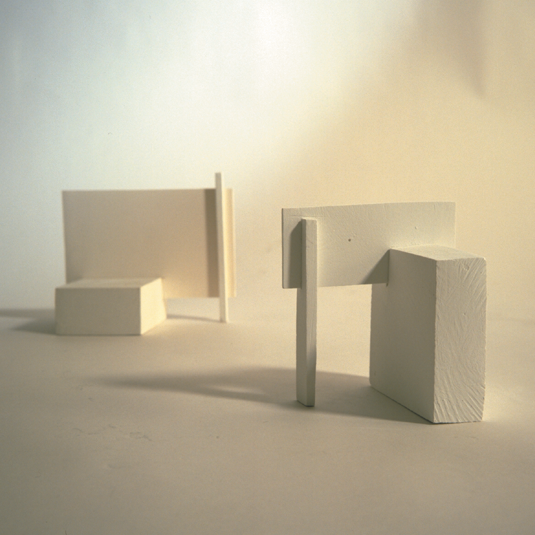
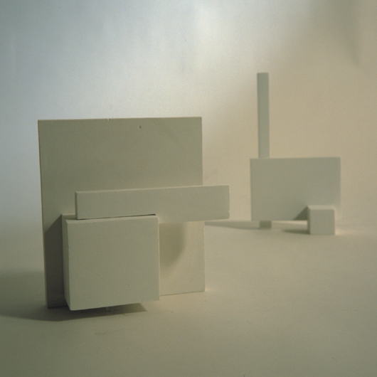
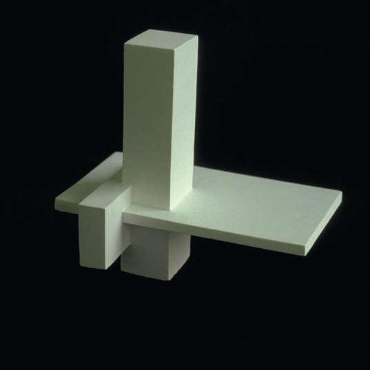
Make up to fifty rectilinear volumes in clay in various proportions. Clay is the best medium because you can easily add and take away. The edges should read as clearly as possible. Organize the rectangles in groups of three, keeping these four principles in mind:
Appreciate the qualities of contrasting shapes. The volumes you choose should vary in character as much as possible, and no two should have the exact measurements. Learn to assess the volume of an element by eye without measuring.
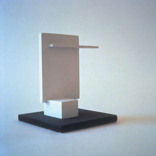
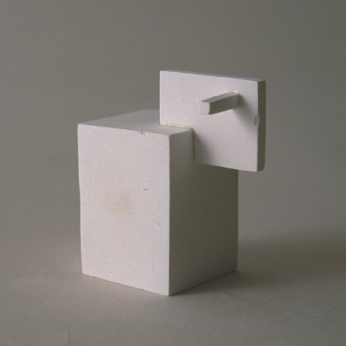
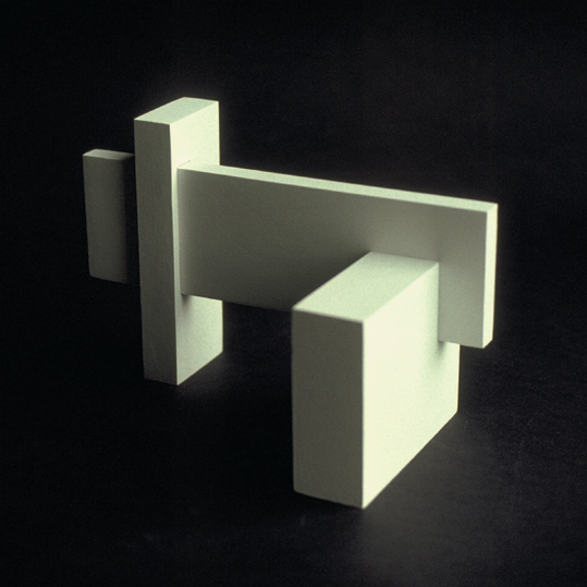
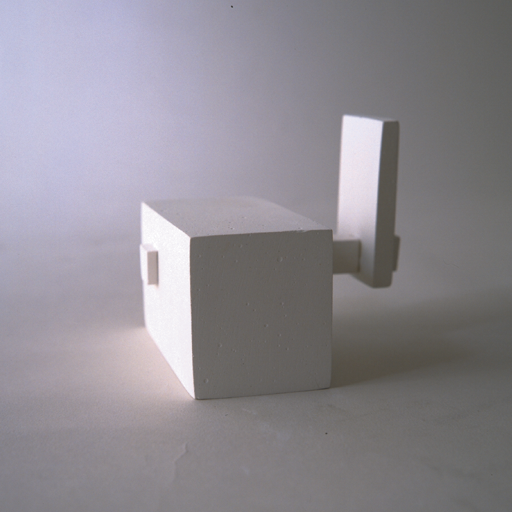
Establish relationships between the volumes by choosing dominant, subdominant, and subordinate forms. The dominant volume is the most significant, interesting, and dramatic element. It occupies the dominant position in the group.
The subdominant complements the dominant. Unless there is a 20% improvement in the character of the dominant when the subdominant is added, more experimentation is needed. The dominant/subdominant relationship can be exciting due to the contrasts in character and positions. More often than not, the relationship is enhanced if the axes are not parallel.
The subordinate makes the design more interesting by introducing a third visual element and axis. The subordinate should make the design more three-dimensional, complement the existing forms, and complete the unity of the design. It is not as independent as the dominant or subdominant. It should be contrasting but sensitive to the other forms. It must be designed to fill in what is missing in the other two.
Be aware of proportions: overall, inherent, and comparative.
- The inherent proportion refers to the proportions within a form: length, width, and thickness.
- The comparative proportions are the proportions of one form as it relates to another. Think of a tall, thin person compared to a short, stocky one.
- The overall proportion refers to the character or configuration of a group of forms. (If you squint and look at the silhouetted proportions of a group of forms, you will see its overall proportions.) No view should be uninteresting. Emphasize the vertical in some and the horizontal in others. Most students make a horizontal overall proportion—perhaps because it seems more stable. Never emphasize the cube.
Varying the proportions in your design is essential. Make it interesting. The last thing you want is a predictable sequence of forms that looks like “going-going-gone.”
The difference between beautiful and ordinary forms is the sensitivity of these proportions. Sensitivity is an intangible but very real quality. Understanding it is one of the most valuable assets for a visual artist. Too much time cannot be spent developing this sensitivity and becoming intuitively aware of beautiful relationships.
Carefully position the axes of the volumes. The axis refers to an imaginary line through the center of the longest dimension of the form and indicates the most substantial movement of the form. The axis illustrates a form’s position in space. We try to give each volume its position in space in all problems.
In this exercise, keep the axes of the volumes static (perpendicular to each other). The static axis is the simplest and will help you get away from flat compositions. Later, in more advanced exercises, you will try to achieve a variety of movements of the axes. To make your designs more three-dimensional, you should use as many movements of the axes as possible. For now, we start with a more straightforward challenge.
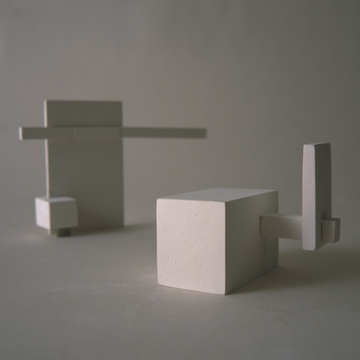
Always conceive a design from all perspectives. Work on a sturdy turntable and continually rotate the sketch to ensure it “reads” from all directions.
Consider how the volumes are joined. There are three ways to join them: piercing, wedging, and cradling.
Ask yourself the following questions as you look at your design:
- Is there a contrast between the dominant and subdominant forms?
- Are they complementary? Are they too similar in size and shape? Students sometimes tend to repeat the same dimensions.
- Is the dominant form in the most prominent position? Students like to put the dominant form on the bottom because that seems to hold things up, but it is not necessarily the dominant position.
- Does the subordinate form add something to the three-dimensional quality and unity of the whole? Sometimes, there is a tendency to treat the subordinate as an orphan.
- Does the design look good from all perspectives, at eye level, and from the top?
In Summary…
The challenge here is to create unity from forms that are as essentially different as possible. Start by designing the dominant, then the subdominant. Spend a little time on this relationship. Quickly complete the subordinate element and arrange with the others to create a grouping that is as three-dimensional as possible. This will give you a sense of the overall configuration. Then, you can begin to refine. Emphasize either the vertical or horizontal proportion in each sketch. All joinings should appear structural. A balance of directional forces should be established. The design should look exciting and three-dimensional from every position. It should achieve an effect of unity in which every part relates to every other part, and every design relationship contributes to the whole.
Unity is the visual glue that holds everything together. You know that you have achieved it when all the visual relationships within the design are organized in such an exquisite dependent relationship that every element supports and strengthens every other. Any minor change would upset the perfect balance and tension.
Take your best sketch and develop it in plaster. You may want to make your plaster sketch larger than your clay piece—perhaps one and a half or two times larger. Differences in proportion will become more apparent as you enlarge the design.
Enlarging is not simply a matter of copying. It requires attention to subtle changes to achieve a harmonious whole.
Be sure to use Hydrocal® cement. The mixture dries harder and cleaner than standard plaster.

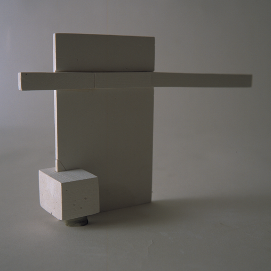


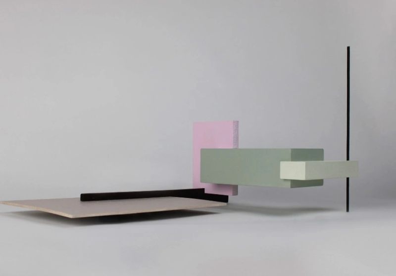
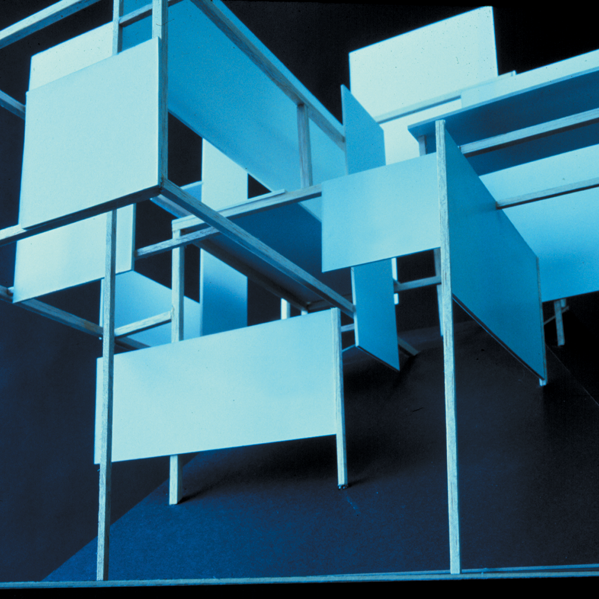
Here is an example of Rose Moon’s Complex Rectilinear Volume Exercise from one of the foundation classes I teach at Pratt. This project was not developed in clay; rather, fragments of scrap wood initially found in the shop.
This problem represents a significant advancement in educational methodologies, posing a substantial new challenge. The fundamental three static volumes problem is the first step in understanding and controlling compositional hierarchy. It is a first baby step. Some students get it right with three elements, some do not. This problem now ups that ante with the use of 5-7 elements, or more. If a student possesses the talent and visual intelligence to manipulate proportions and directional forces, and can organize a more complicated set of variables with competence, resulting in a clearly stated visual organization, then they have achieved advanced sophistication. After all, there is more than just the primary, dominant, subdominant, and subordinate. That is the baby step.
And then we add the dimension of color, which further complicates compositional organization, hopefully, with unity.